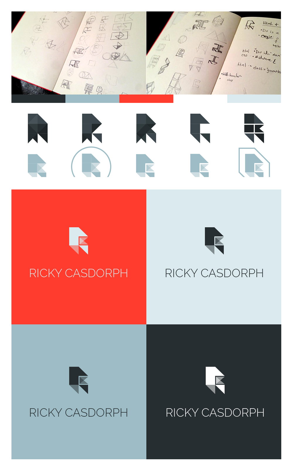
I can get pretty intense when it comes to visual design. I’m a perfectionist at heart. When I’m on a project I refuse to cut corners and just let average work slide. I will sketch thumbnails until my hands cramp, review endless font examples and stare into the colorful abyss of Photoshop and Illustrator. I do this for a living everyday, it’s my passion. However, what happens when I task myself with re-imagining my own visual identity? It’s a fun and taxing problem to solve.
I’ve been wanting to explore new visual directions for my own website and personal brand for awhile now. I finally bit the bullet and jumped in. I’ve always been fond of minimal design. Strong lines and distinct colors are important. White space and strong angles were my focus for the layout.
From the beginning I knew I wanted my updated logo to revolve around my initials ‘RC’. Check out the different variations I came up with above. This was such a fun exercise. The final version balanced out nicely with the visual design of my website. Strong colors, angular shapes and interesting negative space. I almost forgot to mention my choice of font! Font customization is extremely important although easy to skip over. I went with “Raleway-light” with custom tracking and kerning. I posted the final version below.


