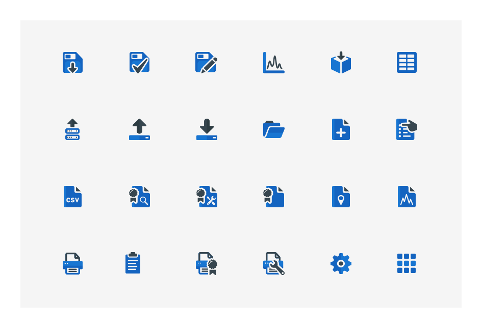
X-Ray Analyzer UI Iconography

Overview

A world class biotechnology product development company needed support in the creation of icons across multiple platforms and devices. There was no predefined guideline or visual style set in place before the project started.

My Role

I worked with the marketing and software development team leaders defining multiple classifications of icons representing a wide variety of user tools, actions and applications. I delivered the icons in their agreed upon style and final deliverable formats for the development team to implement.

Challenge

Working and communicating with two different departments was challenging. Marketing was interested in one specific visual style while the development team was more interested in the intended meaning and silhouette of each icon. A defined visual style that was consistent across multiple applications while meeting the retirements of both departments was required.

Solution

I provided initial concept sketches that helped solidify the foundation of the new visual style. Once the marketing lead signed off on a final style I began working with the development lead sketching out our ideas and defining them using the new visual guidelines agreed upon on in svg format.

Loading animation loop #01
Loading animation loop #02
Icon description...
Icons that were used outside on an embedded device. The predefined user interface included a dark theme with a solid background. While working on this particular set I tested the readability of the icons against the same background outside at different times and under a variety lighting conditions. The white and light blue colors helped increase the contrast between the icons and the background providing a better user experience.


Icon description
This selection of icons were used for one of the pc based applications. This was a more standard app that someone may find on a laptop or desktop pc. Blue was chosen based off of their company’s brand guidelines. I included two different values of blue across this style which helped increase the weight and readability of each icon.


Icon description...
These icons define a wide variety of apps, features, directions, tools and warnings. The darker grey color was used here to instill a sense of consistency across all icons found in the initial install, setup process, windows desktop and taskbar.