Project “RDM” Desktop App Overview
This prospective project involved multiple ux designers working together to meet a short deadline. The complete iterative design process was used beginning with the client kickoff, user interviews, information architecture, wireframing, visual design, pattern libraries and final asset deliverables to the development team. The basis for this project was to update an existing application that was dated in terms of its user experience and visual design.
My Role
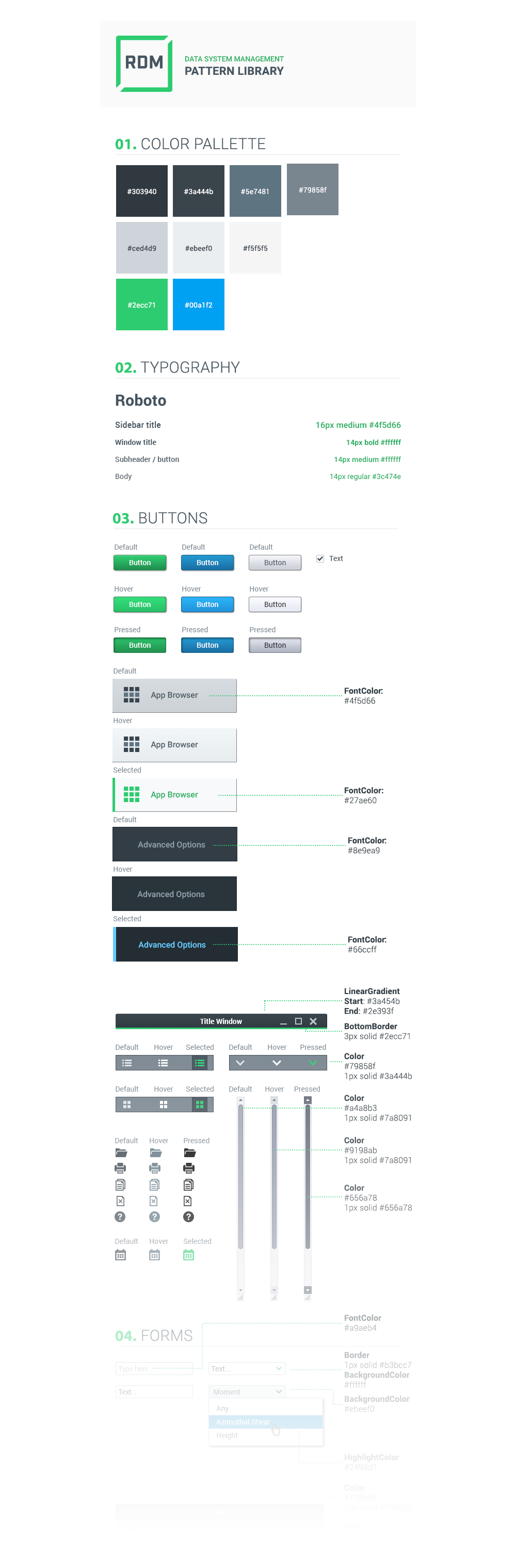
My role involved working with the clients brand identity guidelines and final user interface. I created the final visual design, iconography, typography, pattern libraries and final asset deliverables for our development team while other designers worked on the information architecture, interviews and wireframes. I used the prototyping tool proto.io which allowed us to communicate how the final visual design and interactions worked together for the developers.
Challenge
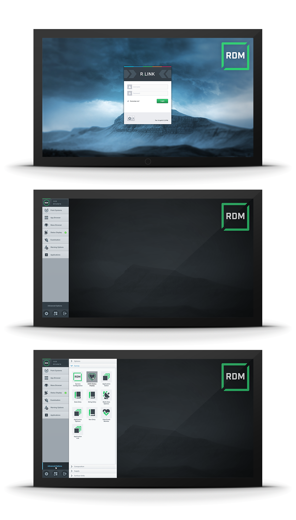
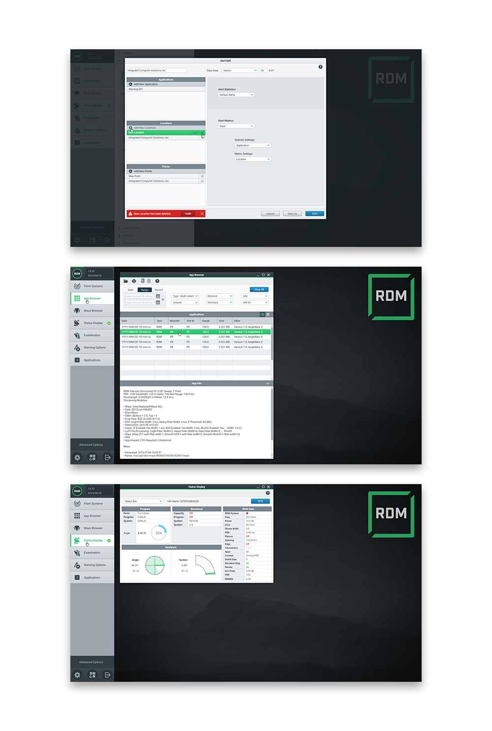
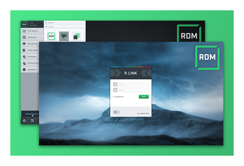
Prospective client was interested in modern interfaces, clean visuals and more intuitive experiences. I was asked to present several different visual concepts for the client to review. They wanted a design that would demo well when marketed and drive their visual identity forward into something clean, minimal and organized. A large number of skeuomorphic icons needed to be redesigned and updated into the responsive svg file format.
Solution
The proposed visual design incorporated all of the client’s requests. 30 different screens were designed and tested by the end of the project. After initially proposing light and dark themed visual concepts the client chose the light version. Once the concept was chosen I began applying the visual design to completed and approved wireframes. General UI components were placed into a pattern library which helped reduce the total number of screens needing final visual treatments.